

DiJones
Real estate
2024
Branding, Print
Eye catching advertising for the DiJones Digest — weekly print publication.
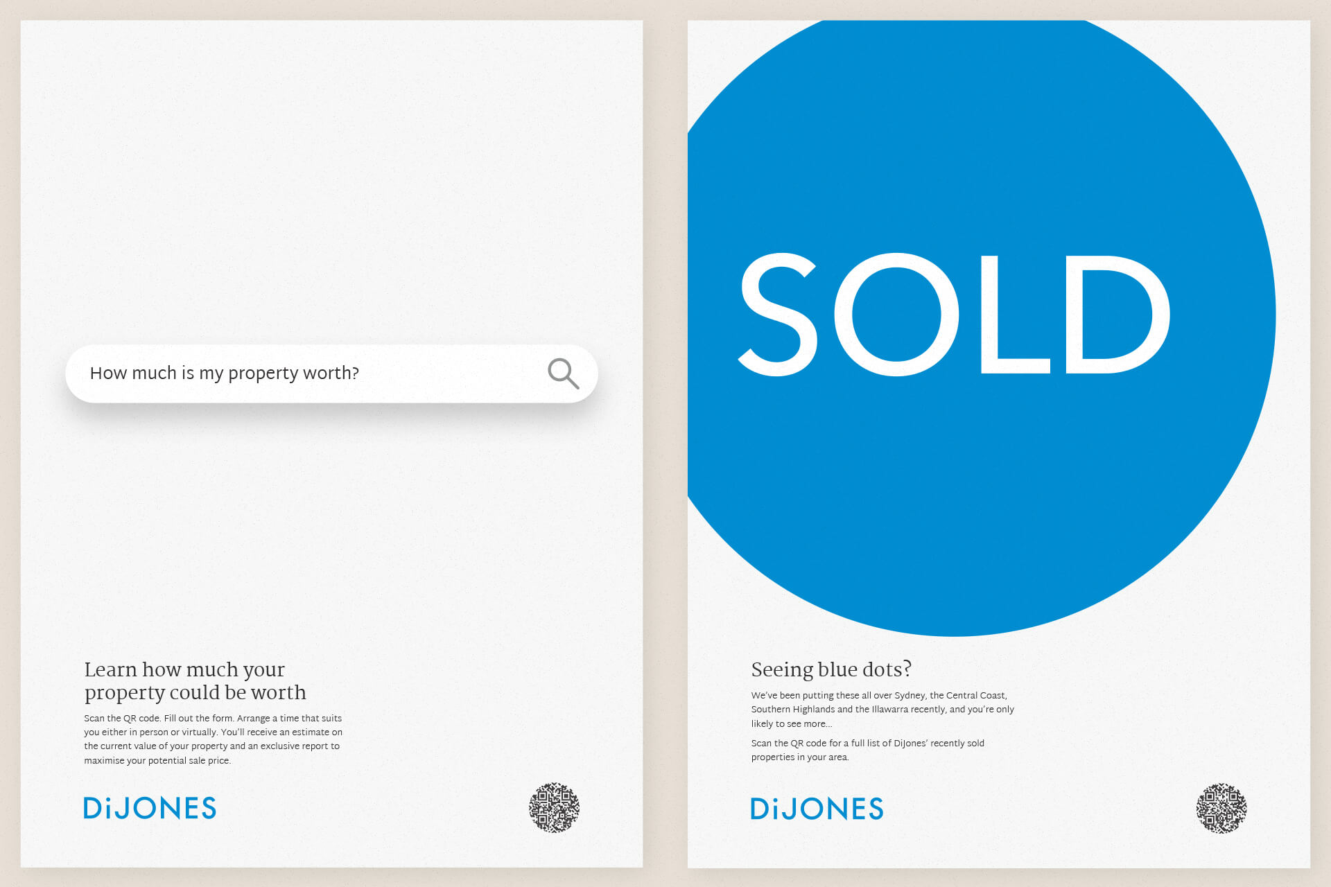
DiJones launched the DiJones DiGEST, a weekly print magazine distributed to local shops, cafés, and community hubs around their offices across Sydney, the Central Coast, Southern Highlands, and the Illawarra.
The brief: design a cohesive suite of adverts that are visually compelling, brand-aligned, and purposeful—even when browsing in a coffee shop, readers should instantly recognise the brand while being guided to listings, advice, agent profiles, and recruitment messaging. The challenge was to balance utility (e.g., listing announcements, QR-driven blog teasers) with long-term brand awareness—without feeling repetitive.
As the sole creative, I owned the concept, copywriting, design, and rollout of the full-page, half-page and quarter-page ad suite — ensuring every piece aligned with DiJones’ tone, visuals, and strategic direction. The project included:
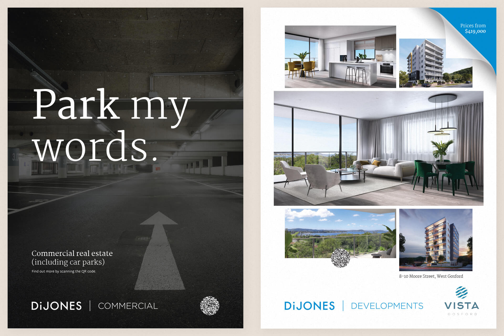
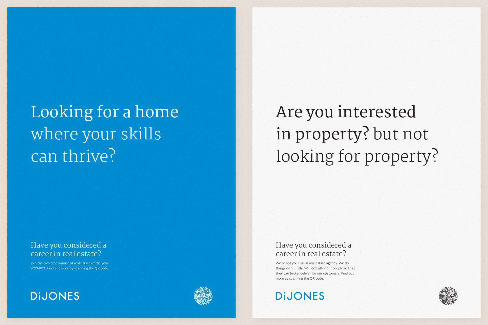
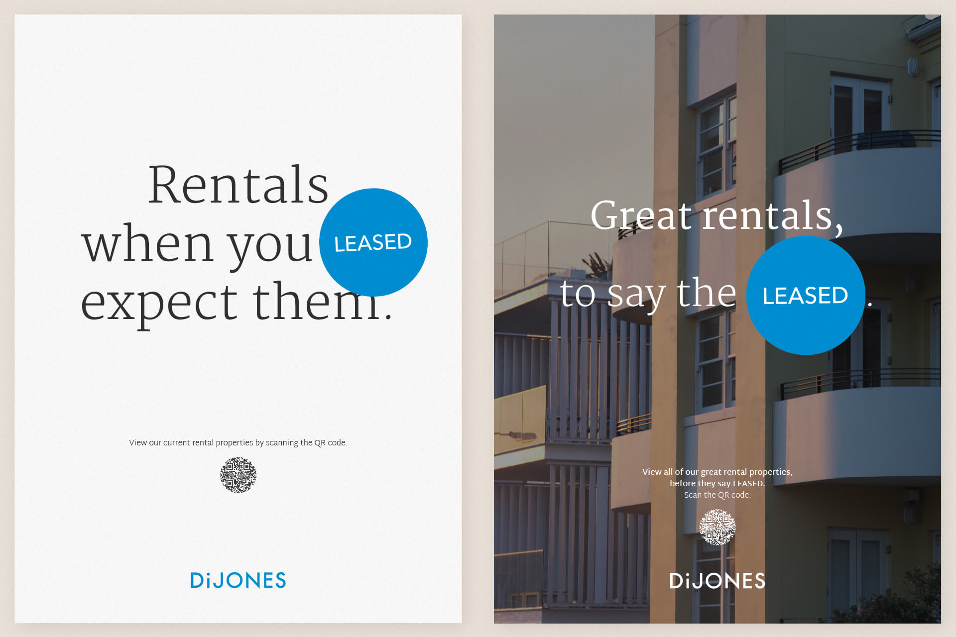
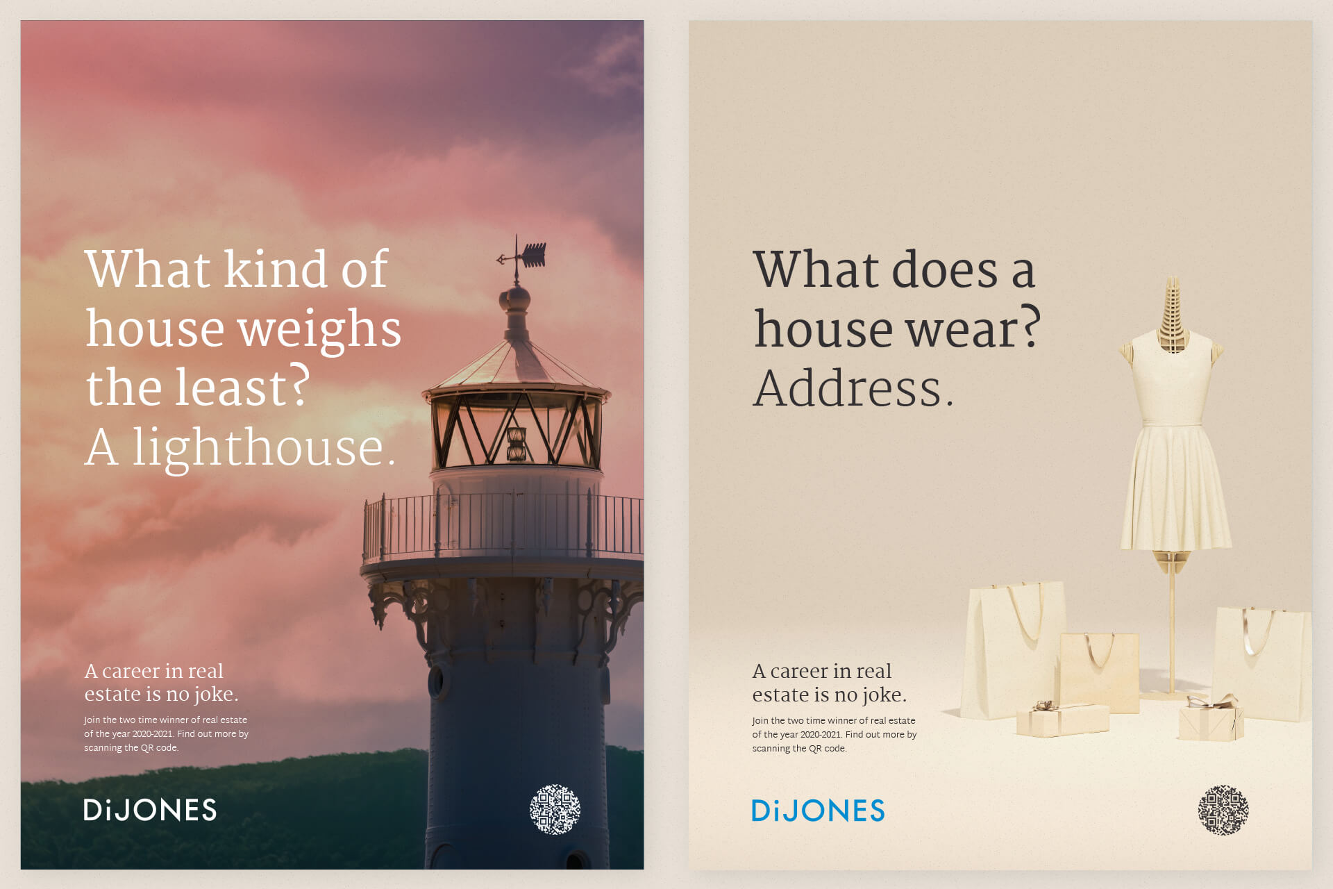
- Property ads (residential & commercial)
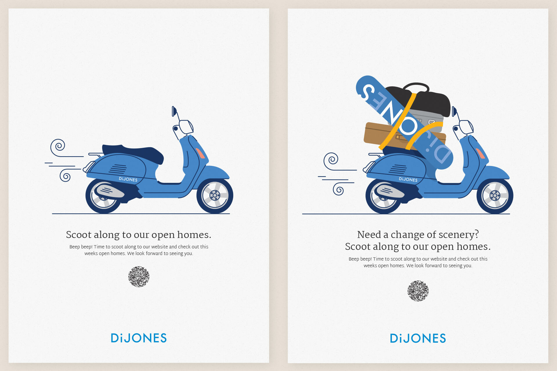
- Open homes & holiday home promotion
- Blog teaser ads with QR-driven traffic
- eBook promotions (buying, selling, renting, investing)
- Recruitment, awards, and agent culture
- Editorial-style awareness ads
- Print-friendly real estate jokes
Every ad had to serve a specific function, but also ladder up to broader brand themes like lifestyle, trust, insight, and growth. Even in a DiJones-owned channel, the aim was subtle brand reinforcement — not just announcement.
The final outcome was a scalable, easy-to-update template system that allowed new ads to be added regularly, while preserving consistency in layout, tone, and engagement. The Digest remains in weekly use, with assets still evolving across the brand’s other platforms.
The Digest now reaches thousands of locals weekly and serves as a subtle yet powerful reinforcement of DiJones’ presence across NSW.


The DiJones Digest advertising suite was more than a collection of real estate promos — it was a living, breathing brand system built for print. By embedding a strong editorial voice, QR-driven calls-to-action, and brand-anchored messaging into each full-page ad, the project elevated a traditional format into a strategic marketing asset.
Each advert worked double duty: some promoted listings or guided users to resources like “how to sell your property in NSW” or “investing in real estate,” while others focused on recruitment, wellbeing, or celebrating the agency’s award wins. The mix of tactical content and brand storytelling helped DiJones subtly reinforce their values while actively supporting their network’s marketing goals.
Working within the constraints of a recurring print format meant building flexible ad templates that could adapt to weekly updates without needing complete redesigns. The visual language, typography, and layout grid were all built for efficiency — making the design system easy to maintain by internal teams or scale with seasonal needs.
The project is a strong example of print-based real estate marketing strategy that still feels human, fresh, and useful. It also shows how a channel often treated as “just browsing” can be leveraged to deliver long-term brand reinforcement, campaign alignment, and even digital traffic via QR.